Timeless City | An Introduction
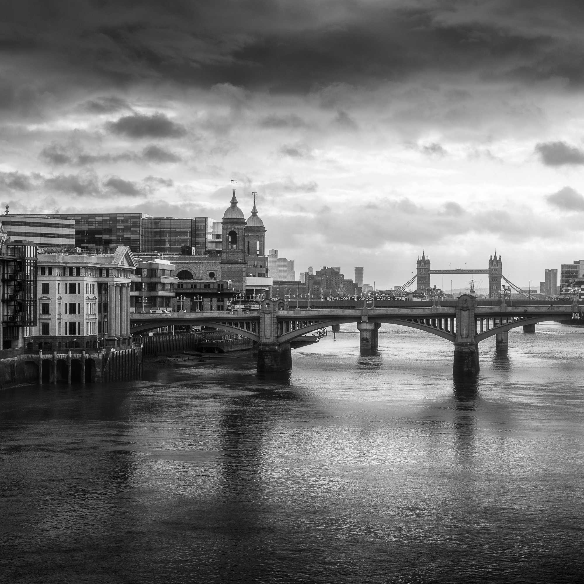
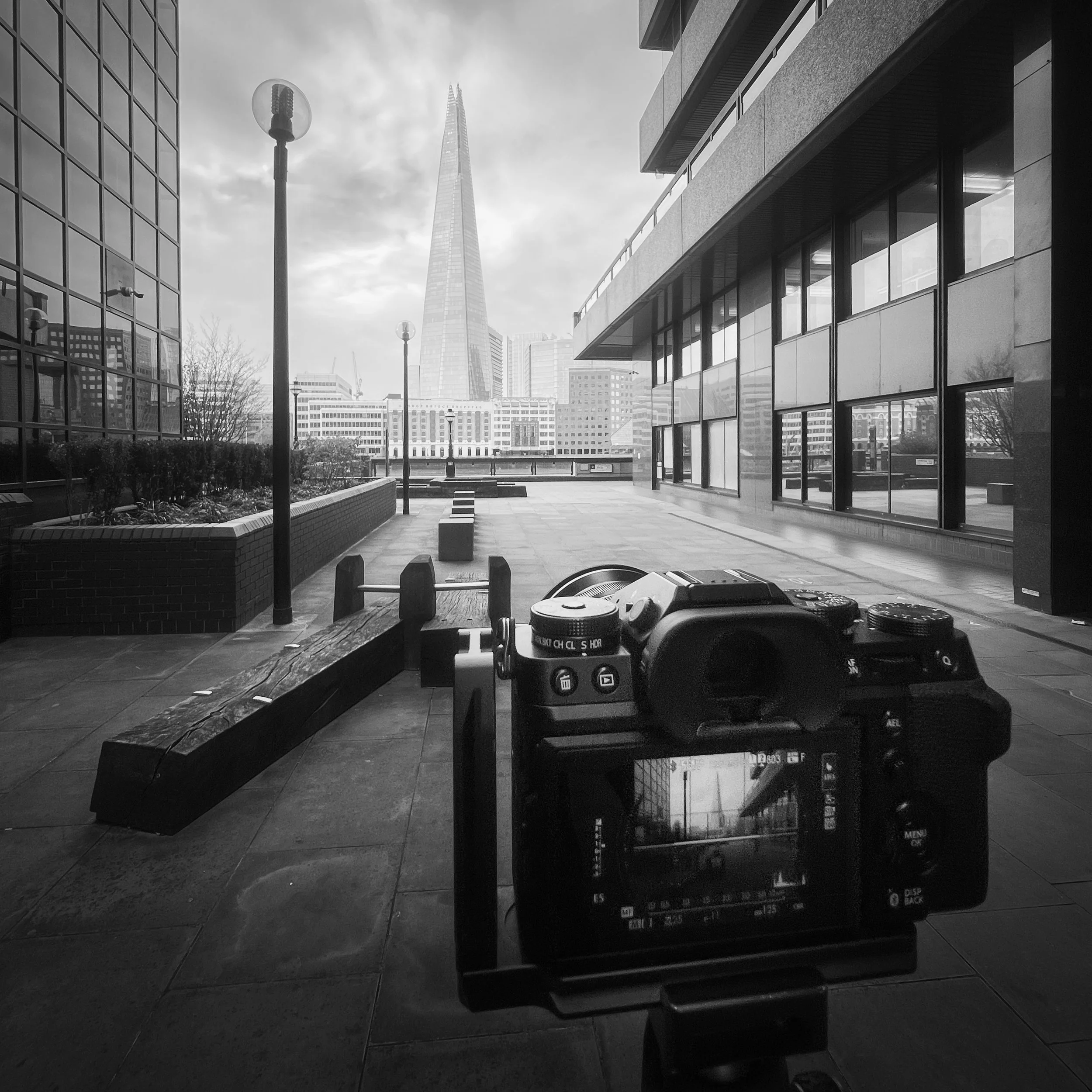
London is my local city. It’s the closest city to where I grew up, a place I’ve worked for quite a few years and ever since I first picked up a camera and started taking photography more seriously, it’s a city I have spent countless hours photographing.
Why London?
Growing up in the suburbs, I didn’t visit London often as a child, when I did, it was usually a family day out or a school trip to some of the tourist hotspots such as the Tower of London or Trafalgar Square. I remember walking around the city, dwarfed by the buildings around me, in awe of the many different styles of architecture I saw. The hustle and bustle, the noise, and so many people; it was a different world to the one I was used to. This was all decades ago, when there were just a handful of buildings taller than St Paul’s Cathedral and over on the Isle of Dogs stood a solitary One Canada Square. How times have changed.
Fast forward a few years and long before I’d taken up photography, I took a job which involved travelling to London almost every day and getting to know the city much better. My work took me all over London and this is when I first started to build my own, personal connection with the city.
In 2016, photography started to evolve from an occasional hobby, photographing a bit of everything, to the passion it is for me today. After a few years of working closer to home, I was back in London most days and naturally drawn to landscape photography and given the connection I’d already built with the city, it made sense that I would feel more compelled to point my lens at London’s incredible cityscape.
Since then, I’ve spent an untold number of hours across countless visits to the city walking the streets, seeking out new compositions and like all landscape photographers, hoping for perfect conditions in a bid to take that perfect image, knowing full well that such a thing doesn’t exist.
I chose to use “Timeless” in the title because from the subject to processing style, I felt it represented a few of the important ingredients that make up this project.
London as we know it has existed for around 2000 years, from a time when Londinium was the size of Hyde Park to the megacity it is today. Throughout all that time, architectural styles have inevitably evolved, from the medieval Tower of London, English Baroque such as St Paul’s Cathedral through to post-war brutalist and the contemporary 21st-century style with plenty of glass being used today.
London’s iconic cityscape is still represented by all of these architectural styles, and this is why timeless doesn’t mean a city that never changes, embodying just a single point in history. To me, it means a city that represents all times, a place consistently evolving over hundreds of years to a point where all of the significant architectural ages London existed through are represented across its skyline. With both old and new coexisting side by side, I wanted to capture a sense of that in my work.
Although the need to develop and evolve with the times has contributed to London’s ever-changing cityscape, this somewhat mishmash of styles has by no means been solely by design. Through the many turmoils the city has faced, such as the great fire or the blitz, London has been forced to rebuild significant parts of the city over the centuries, and one of the challenges I relish is to seek out ways to represent London in my photography and how it’s many structures stand together side by side in what I can only describe as a chaotic harmony.
The goal here isn’t to produce an “old and new” series of photos and even though most of the photos I take will include more than one architectural style in the frame. The goal is to document London’s cityscape across the entire body of work from high up in the rooftops with views stretching for miles, to closer, more intimate photos where scale can be represented better by including a subject in the composition.
At the time of writing this post, the earliest photo I have included in this project was taken in 2018, which, in the grand scheme of time, isn’t very long at all, but still long enough for many changes to take shape across London’s cityscape between then and now. The rate at which new buildings are being erected, particularly in the financial districts is accelerating and as I continue to take new photos, I will be inadvertently documenting these changes as they happen. If this ends up being a very long-term project, I think it will be good to look back at how the cityscape used to look years before.
Why this aesthetic?
Something important to mention about this work is that it is intended to be more of an artistic project than a documentary one, and every photo is taken with the full intention of being edited in post-production. This will include converting the raw files to black and white (more on that later) and alongside some usual tonal and contrast adjustments, I use plenty of selective dodging and burning to achieve the final look.
I still, however, have my own views about authenticity and how I edit my images. I never swap out the sky and never add something that wasn’t in the scene at the time the picture was taken. I might clone out the odd distraction if I feel it is taking away from the aesthetic, but these are typically transient elements such as rubbish in the foreground, old chewing gum on the pavement or the odd crane in the background. I want the viewer to be confident that if they were standing next to me as the shot was taken, they would have observed the same scene I show in my final image.
Alongside those adjustments, if the dynamic range is too much or I want to illuminate certain moving elements in the scene, I will blend images. I will only do this if there is just a very short time between frames and the camera has not been moved.
Sometimes reality doesn’t quite behave as we want, and we need to find our own limit as to what we are willing to do to get the final image. There is no right or wrong answer here, but I do believe in being upfront and honest about how the photo was created. You should stand by your work and not purposely mislead the viewer.
Getting back to the point about this being more of an artistic project than a “straight out of the camera” documentary, I wanted to give the finished photos a timeless look and feel.
I felt to represent the work as a single body, I had to ensure the final look was as consistent as it could be and given the ever-changing conditions, the many different styles of architecture and the multitude of colour in the scenes I photograph, removing colour and producing only black and white work seemed the right choice.
Of course, I still love colour photography and still produce most of my landscape work this way. So, once the project was starting to take shape and I ventured out into London to deliberately take photos for this black and white project, I learned very quickly that I would have to think and see differently. I had to remove colour from being a compositional element and focus only on shape, form and light. I feel, however, that it was a necessary step to make, as in addition to a more consistent look, black and white photography has a timeless feel about it, as the process does not age the photos and although I have no intention of doing so, they are free from a style that represents any contemporary trend in my work.
Another creative decision I made for this project was to use the square format for all finished photos, and like my decision to only process the images in black and white, there are several reasons for this. The first and most obvious reason for the square is that by having a single aspect ratio for all photos, it helps when trying to obtain a consistent look across the entire body of work.
Additionally, using a square crop has other compositional advantages. For instance, it can help when placing the subject in the centre of the image. I tend to do this quite often and the square crop, with all sides equal, can further emphasise that symmetry in the frame.
For a landscape photographer, the square format may appear more restrictive than the traditional 3:2 or 4:3 aspect ratios, but that’s not the case at all. I feel I have more freedom when composing a photo as the traditional “rules” carry less weight. Having equal sides seems to reduce the need to compensate when composing the image. I’m able to place the subject close to the middle or nearer to the edge of the frame without feeling the picture lacks balance.
Michael Kenna’s work is frequently referred to as being “zen-like” and although I’m sure this has a lot to do with his photographic style and technique he uses, I think that his use of the square format and the compositional freedom it provides has a little something to do with it too.
What’s next?
It’s early days and way too soon to know where this project will go. For now, I’m enjoying heading out with my camera and shooting new images for the collection alongside my traditional landscape work.
I’m still tweaking and refining as I go and allowing the project to develop as the body of work builds.
Along with a spin-off Instagram account dedicated to the project here: https://instagram.com/_timeless.city_, I wanted to give the project a permanent home, so I created this project page. I plan to update the page now and then with newly released photos and if I publish any more “behind the lens” or general blog articles related to the project, I’ll also post them there.
I’ve started to think about how I might present the images and at the moment, I have a few themes such as views from the rooftops or from along the Thames. There are, however, other images creeping into the collection that don’t fit a specific theme just yet and as long as they align with the spirit of the project, I’m quite happy to let them lead me somewhere new.
To get the very best experience of one’s work, I truly believe photography should be printed so I will of course be printing this work. To start it will be printed just for me, but in time I would love to turn this project into a series of zines or maybe even one day, a coffee table book. Thats a little way off yet but certainly something I would like to aim for.
That’s it for this project intro. Hopefully, you found that useful, but as ever, if you have any questions and want to know more about the process or ideas for future blog posts, just drop them in the comments below.
Until next time.
Trevor


