
BLOG ARCHIVE

Seascapes by Nigel Danson | My Photo Bookshelf
Nigel Danson's Seascapes, the third book in his series, beautifully captures the dynamic and ever-changing coastal landscapes through a stunning collection of photographs.
Author’s synopsis
Throughout this book you will see that I have tried to capture the essence of why I love being on the coast and by the sea. A massive part of that is how the sea interacts with the land. I am fascinated by this connection and how the sea has shaped the landscape through constant erosion and pounding of the rock, sand and salt water.
I share my favourite seascape images and talk about why I photographed them, how I composed them and the cameras and settings I shot them with.

Seascapes are the most dynamic of all forms of landscape photography. In this book I take you on a journey of discovery of coastal views, stunning beaches and epic waves. These images all hold a special place in my heart.
My thoughts about the book
Keeping the familiar design of the trilogy, Seascapes features the same cloth finish and foil lettering as Vistas and Woodlands, a detail I really appreciate. The book has a high-quality look and feel, perfectly complementing the photography inside.
The book opens with an introduction by Nigel, where he reflects on his connection to the sea and coast, shaped by childhood memories. This resonates with me, as much of my photography is driven by a deep sense of connection and nostalgia, and I can appreciate the desire to create work that goes beyond aesthetics and holds personal meaning. I guess there is a stronger authenticity to work created in such a way.
The book is divided into chapters: Coastal, A Wider View, Waves, and Abstract, and each starts with a brief paragraph in the way of a small introduction to the topic. As expected, the photography throughout is outstanding, showcasing a wide variety of work that makes for a compelling and diverse exploration of the book’s theme.
Nigel is one of the UK’s most highly regarded and accomplished landscape photographers, a reputation built not only on his exceptional skill and talent but also on his dedication to his craft. His success is not just a result of his ability behind the camera but also the time, effort, and passion he invests in projects like this book. His commitment to creating high-quality, thoughtful work is what truly sets him apart.
Book Details
Linen cloth Hardcover
Size: 300mm x 240mm
Pages: 128 litho printed pages on 200gsm silk art, FSC sustainably sourced paper
Availability at the time of writing: Limited edition still available from Nigel Danson’s website here: https://www.nigeldanson.com/products/p/seascapes
Links to my review of the other two books in the series can be found below:


Until next time.
Trevor

New Photos | Winter 2024
A collection of photos taken during Winter 2024.
In keeping with the previous four seasonal photo updates, I’ve collected a few of my favourite photos taken during the winter months of 2024/2025. This is an opportunity for those visiting my site and reading my blog to see my latest work before it’s posted to social media in a format and style I want it to be presented in. There are no algorithms or preferential treatment here, meaning you get to see the photos I post in the way I want them viewed.
As ever, I welcome any feedback, comments or suggestions either by email, through my contact page or just as a comment at the end of this post.
Below are the previous four instalments of my “New Photos” series.


December 2024 to February 2025 - Winter 2024 collection.
In a change from the previous seasonal collections, I’ve started this one with a few photos I took of London during winter. It may not be apparent to everyone just how much the different seasons affects the photos I take in the city, and for sure, visually, the differences might be less obvious than other landscape photography subjects, but the time of year still makes a huge difference to how I go about taking cityscape photos in London.
The main seasonal factors that affect the photos I take are the weather conditions, the sun’s lower position during the day and where and when the sun rises and sets. I’ll expand on these as we go.
Photographing London
Although most of London requires you to obtain a permit(s), or at least formal permission to fly a drone, there are a few specific locations where my sub-250g drone can be flown freely and here, in front of the Isle of Dogs, is one of them. This photo I took of Canary Wharf highlights one of the key factors that affect my photos in London during the Winter….. the weather.
Blue sky days can be few and far between in the Winter, and the days are more likely to be cloudy like this. But to tell the truth, that’s how I like it. In the summer, I feel I am endlessly dodging the high contrast sunny conditions, which I don’t usually like to photograph in. Unless the light is amazing and the sunset/sunrise epic, I would much rather have an overcast, moody day to photograph the city.

I’ve recently started to lean towards a vertical composition using the traditional 10x8 aspect ratio. I feel I can emphasise the height and scale of the city better in a vertical format, and cropping down to the 10x8 aspect ratio makes the overall composition look more balanced than the taller, native 3x2 my camera uses.
Another advantage of photographing London in the winter is being able to get to the city before sunrise and take some photos while it’s still dark. Of course, I could simply hang around after sunset in the evening, but the advantage of taking photos early in the morning is that it’s a lot quieter, and I don’t have to contend with so many people around me walking in and out of frame.


The last point I’ll make about photographing London at different times of the year is where the sun rises and sets. You should get to know what scenes work best at specific times of year to capture the best photos. The photo above taken from the Horizon 22 viewing platform is a good example as in the summer months, the son would be setting way off to the right and this view looking towards The Shard with the sun setting just off to the right would not be possible.
Ok, so this panoramic photo I took of Canary Wharf from across the Thames is proof that we still get some cloudless skies in the winter and the fact that the skies over London are always grey is a bit of a myth really.
The Winter Landscape
This winter, I didn’t get out into the landscape of woodlands as much as usual. Instead, I spent more time photographing London, taking photos for my Timeless City project. I guess some things always have to give.
I did, however, venture out into the wintry landscape a few times and have shared some of the photos I took along the way. All the photos in the landscape section of this post were taken during a handful of trips to a local forest in East Sussex. This is my go-to for woodland photography, but with lots of open heathland and the odd lookout point, it’s also great for a bit of landscape photography.


I’m really pleased with these close-up icy scenes I found next to a small waterfall in the forest. I took three compositions of the ice, and with lots of relative depth, each one needed to be photo stacked to get the image sharp from front to back. I’m really happy with the resulting triptych below.
I’ve also posted a photo I took of the wider scene underneath, and the small patch of ice on the bottom right of the frame is where I took these close-up images of the ice so you can see how tight I needed to get.


Photographing the woodland
Along with some misty woodland adventures I had during the winter months, I also took this first group of four photos shown below. Sometimes, the eye sees what the eye sees, and on this cold but mistless morning, I was drawn to the stronger shapes created by some of the more prominent trees in the scenes I came across.
For these to work, I had to find a strong woodland subject with some character, set against thicker foliage to help remove background distractions, and with the ambient light being dull and gloomy, the resulting collection of photos all have a dark, moody feel to them.


A trip to the East Sussex Coast
Finally, a trip to the seaside. I decided to head down to the coast on a chilly February afternoon to revisit my favourite lighthouse at Beachy Head, followed by a few hours in Eastbourne to photograph some of the starling murmuration around the pier.


Once the sun had just about set and the starlings safely nested under the pier, I took this last picture of what I think is the most picturesque pier along the Sussex Coast. I like the soft, blue tones across the scene, but that subtle belt of colour in the sky adds a touch of interest and is a welcome addition.

With the winter months behind me, it’s time to look forward to spring and the colour it brings to the landscape. I’ve got a few adventures planned and some new ideas for projects that will help me focus on photographing my local landscape more this year. Time will tell if that all works out as planned but if it does, you’ll see those photos here first.
As I mentioned before, feel free to drop a comment below as it’s always good to hear your thoughts about the pictures I take and how they might resonate with you.
Until next time,
Trevor

Land by Fay Godwin | My Photo Bookshelf
Land by Fay Godwin is the superb result of a decade-long photographic project to capture an unfiltered view of Britain’s diverse landscapes
As I delved deeper into the history of landscape photography, it was inevitable that I would come across some of the most well-known American photographers, such as Ansel Adams and Edward Weston. But what about the iconic British landscape photographers? Of course, we have David Ward, Charlie Waite, and my personal favourite, Joe Cornish—all still actively practicing landscape photography. However, in the same breath, one must also recognize Fay Godwin, one of the few professional landscape photographers of her time.
Fay Godwin travelled across the UK, documenting its landscapes through her lens. In 1985, she released Land, a book featuring photographs primarily taken in the preceding decade. This book and its accompanying exhibition cemented her status as one of the UK’s most treasured landscape photographers.
Author’s synopsis
This magnificent collection of photographs is a unique celebration of the British landscape by one of the finest landscape photographers of our day. Combining documentary realism with a poetic instinct, elemental forms with visual irony, Fay Godwin brings a distinct and individual vision to her work.
Paying tribute to the achievement of a ‘true artist’, the novelist John Fowles makes his own eloquent statement on art and the landscape in his penetrating essay.

My thoughts about the book
While researching Fay Godwin’s work, I came across the video I’ve linked to below, and one thing Fay talked about that stuck with me was her take on landscape photography and her dislike for the blue sky, green grass, “postcard” scenes. Fay tried to portray a “real” view of Britain’s landscape, sometimes picturesque, sometimes bleak, but always natural and always honest.
‘Land’ starts with a multi-page essay by John Fowles, followed by an introduction by Ian Jeffrey. From there, we get Fay’s photos. Taken over ten years, the pictures (kind of) flow geographically, starting up in Scotland, working down the UK, and ending with photos taken on England’s south coast. Along the way, Fay photographed various landscapes, some more picturesque than others, visiting locations such as the Scottish Highlands, Yorkshire, Wales, Wiltshire and Kent.
It’s evident from the photos included that Fay had a remarkable ability to find beauty in a wide range of subjects. Some are familiar, such as the sweeping natural vistas of Glencoe and the Lake District, while others are more unconventional, like a close-up of a cobbled road in Yorkshire or a rusted car partially submerged in water in Kent. This diverse subject matter reinforces my belief that Fay was less concerned with adhering to traditional landscape photography conventions and more focused on capturing an authentic, unfiltered view of Britain’s landscape, one she openly admitted to finding far more compelling to photograph.
With such varied subjects, one might expect the sequencing to feel disjointed, but impressively, that’s not the case. The images flow seamlessly, a testament to Fay’s careful attention to the book’s layout.
Fay Godwin (17 February 1931 – 27 May 2005) was a British photographer known for her black-and-white landscapes of the British countryside and coast.
Along with the video, this book has reminded me that landscape photography isn’t just about finding picturesque views of the world around me. It’s about capturing something I find interesting, regardless of social norms and by doing this, I can create a more honest and unique body of work.
Book Details
Softcover
Size: 260mm x 260mm
Pages: 160
Availability at the time of writing: Unavailable from the usual UK booksellers. Consider buying a used copy.

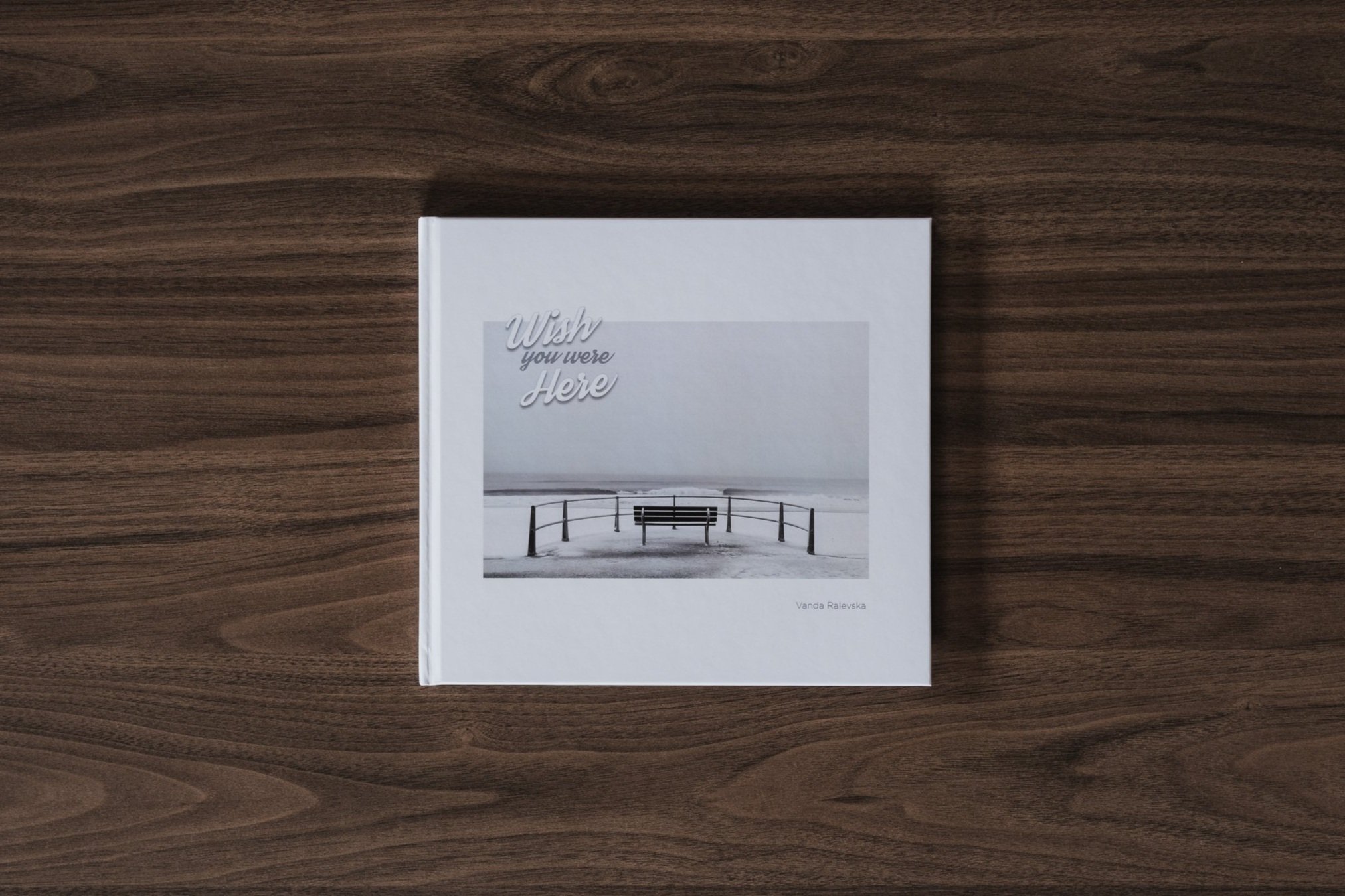
Wish You Were Here by Vanda Ralevska | My Photo Bookshelf
A companion book set created by Vanda Ralevska featuring a collection of photos of the iconic British seaside.
I’ve always loved spending time by the British seaside in the warmer months. I love the energy, the vibrancy and who doesn’t love eating a traditional fish and chips on a deck chair while staring out to sea? But, as I’ve grown a little older, I’ve started to visit the coast more often in the colder (and wetter) months. Nothing beats grabbing a hot coffee and having a relaxed wander along a quiet promenade with just the sound of the distant waves breaking on the beach.
So, when fellow photographer (and now friend) Vanda Ralevska released her Wish You Were Here book set featuring some outstanding photography of the British Seaside, I knew I had to purchase myself a copy.
Author’s synopsis
This companion book set explores the nostalgia of the English seaside throughout the seasons, from the sombre beauty of winter months to its restored splendour in the glorious days of summer.
There is a melancholy about the English seaside in winter. No matter what Mother Nature throws at it, there is a resilience that enables it to resurrect its full magnificence in summer months.
It goes into hibernation, it falls into slumber and sleeps dormant like a perennial plant, just to flourish when the sun and warmth come back.
Like trees that are bare and stark in winter. But in the summer they become beautiful, vibrant and everything we love about them.
What started as a pure fascination and attraction turned into a lifelong passion. There isn't any other place I would rather be than a beach. Though I enjoy the peaceful and quiet wintertime most, I find the bright and sunny weather as captivating as the bleak and gloomy days. Therefore, I felt I needed to capture both sides of the English seaside and separate them into two books that complement each other.
My thoughts about the book
First things first, and I’m not just saying this, but I love these books. The photos included are well-crafted, and expertly composed, with subtle seaside humour and ironies implied throughout. As I mentioned in the intro, I love both sides of the seaside experience, from the fun, warm, summery days to the calmer but much colder days in the winter and this companion book set encapsulates those experiences perfectly.

The book set is comprised of two books. Kiss Me Quick is fun, vibrant, and full of photos of blue skies and seaside colours. The pictures included are colourful but well-controlled and have an aesthetically pleasing but subtle high-key processing applied to them. The photos are all in square format, which, as you may have read here, is one of my favourite aspect ratios and works incredibly well for this collection.
The image sequencing throughout is, in my opinion, a bit of a master class and taught me a thing or two about how well a book can be pulled together. There is a good mix of clever, humorous, and more subtle pairings. I know first-hand that Vanda invested a considerable amount of thought into sequencing the images for both books and the results speak for themselves.
The second book, in contrast to the first, represents a more subdued, desolate seaside experience and with the lack of blue skies and vibrant summer tones, Vanda chose to process this collection in monochrome, which suits the work well. Having recently embarked on my own black-and-white journey with my Timeless City project, I felt a deeper connection and was able to appreciate this collection of work far more than I might have before when processing predominantly colour work.
Individually, these books hold their own as separate collections of photographic work, but putting them together as a single book set was a master stroke by Vanda as together, they tell the complete seasonal story of the British seaside that most of us in the UK have experienced at some point in our lives.
Book Details
Hardcover
Size: 210mm x 230mm
Pages: 140 (Wish You Were Here)/124 (Kiss Me Quick)
Availability at the time of writing: Available directly from Vanda’s website here: https://mylenscapes.uk/wish-you-were-here/

Creating my limited edition Timeless City prints of London
Take a peak into the process I follow when choosing, printing and sending my limited edition, Timeless City, fine art prints of London.
Taking photos can be such a creative and fulfilling process and after capturing that epic vista at sunset or carefully crafted cityscape scene, for me, viewing work on a screen does not compare to the impact I get from holding a fine-art print in my hand or seeing it mounted, framed and hanging on the wall. A physical print can bring a photo to life and transport the viewer to another time and place, evoking all kinds of emotions and memories.
With so many photos observed on social media for just a few seconds before the inevitable swipe of the screen, the physical print invites viewers to slow down and engage deeply with the work. It’s a more intentional way of experiencing photography. As Ansel Adams famously said, "The negative is the equivalent of the composer's score, and the print is the performance.” Maybe, for the modern age, you could replace the negative with the digital raw, but you get the point.

Printing my Timeless City, black and white photos of London
When my Timeless City project started to gain a little momentum and a body of work was forming, I thought about ways I could transport the photos I’ve taken from the screen into print and one of the options I’ve decided to pursue is to offer fine-art prints for those who follow the project to own.
I wrote this blog post to accompany the new print store for two reasons.
To share the attention to detail and craftsmanship that goes into producing my high-quality, archival fine-art prints.
To help photographers who are starting their own printing journey by outlining my process.
Choosing the photos for the limited edition prints
Choosing the photos I want to include in a limited edition collection is an important and (to me at least) difficult decision. On the one hand, I’m including what I subjectively consider some of my very best work, which I hope will also appeal to a potential print-buying audience. On the other hand, I have to be comfortable with the fact that those images will be limited in number and once finished, never printed in the same way again.
Once shortlisted and to ensure quality, I printed the images at their intended sizes—7x7” and 10x10”. I printed the shortlisted photos at this early stage because I’m aware that not all images translate well from screen to paper, and this step helps eliminate any that don’t quite hit the bar. This step also helped me narrow the selection to an initial 12 prints I wanted to start with.

Choosing the right paper to print my photos
There are several things to consider when printing images and paper choice is arguably the most important decision I needed to make. In my mind, I have a particular look I want to achieve, one that I feel suits the work best and here’s a brief breakdown of the process I went through when choosing the right paper for this project.
Paper Size: I want the finished work to have a more intimate look and feel. There’s a quiet subtlety to my black and white photos of London and I don’t want the prints to overwhelm the space they are displayed. I think a smaller picture with a wide mount and subtle frame suits the work better. The other benefit of printing the photos in 7”x7” and 10”10” is that I can print, sign and send the work directly, meaning I can control the entire printing process and ensure a high degree of quality control.
Paper Type: By paper type, I mean choosing between normal, photo-quality paper or acid-free, archival paper. For limited-edition, fine-art prints that will appeal to both casual buyers who appreciate my work and the serious print collector, I feel there is only one option for this project and that is acid-free, archival paper.
Paper Finish: When testing the different papers from my preferred manufacturer (Fotospeed), I found they had a range of colour temperatures and finishes, from smooth to textured, from matt to glossy and from warm to cool. I already knew I wanted a cooler, non-textured, semi-gloss finish so I purchased a test pack of papers with various options that aligned with what I wanted and got busy testing.
After extensive testing and lots of printer ink used, I found Fotospeed’s Platinum Baryta 300gsm the best paper for the job. I love how my black-and-white cityscape work looks and with a throwback to the dark room look Baryta paper provides, there is a classic, even ‘timeless’ look to the final print. Here’s a description of the paper I pulled directly from Fotospeed’s website:
Platinum Baryta 300 is 100% acid-free, Fine Art paper with a smooth unglazed gloss surface. A natural white base and state of the art micro-porous ink receiving layer delivers a high D-MAX (2.99) and wide colour gamut. Platinum Baryta 300 reveals delicate highlights and smooth transitions to shadows for both colour and B&W printing. The paper is approved by the Fine Art Trade Guild and when used in conjunction with pigment inks will ensure a print life of more than 85 years.

The process I follow for printing my Timeless City photos
As I mentioned at the start of this post, the experience of viewing pictures on screen doesn’t come close to the feeling of holding a print in your hand, but it doesn’t stop there. To get the very best print possible, a few things need to be done to adapt the image so that how it looks on screen is as close as possible to how it looks on paper.
Preparing the image file for printing
There is a big difference between viewing an image on a backlit monitor to an image on paper with only reflective light available. Ultimately this means that if I don’t tweak the image first, it will likely print dark, soft and lack contrast. So these are the main things I change for each image before printing.
I will normally boost the brightness by half a stop or more, increase contrast, and sharpen the image. Alongside these standard tweaks, I will often selectively dodge and burn (decrease or increase brightness) in specific places to ensure those areas retain detail and contrast once on paper.
Although Platinum Baryta 300gsm is on the whiter end of the fine art paper spectrum, it still prints a little warm for the look I am after, so for every photo, I adjust the white balance slightly to cool the image down meaning the printed image will appear more neutral and not to warm. This is purely to taste and not a necessary step for everyone.

Using the correct printer settings
When sending the image to the printer, certain settings must be used. I won’t list them all, but two points I feel are incredibly important to get right are using the right profile for the paper and printer combination and setting the right paper type in the printer settings.
Using the correct ICC Profile: As I mentioned before, my paper is manufactured by Fotospeed and they provide standard ICC profiles (and instructions) for all papers when printed on a Canon or Epsom printer. All I had to do was download the right profile, install it and select that profile in the print options.
Setting the paper type: The second setting I always check is choosing the right paper type from within my Canon printer’s settings. Again, Fotospeed provides a handy table on their website which matches their paper to the options available in the printer settings. For example, to get the best results when printing on Platinum Baryta, I need to select “Photo Paper Pro Lustre” from the Canon printer settings. Without setting this, I won’t get the final look I want.
Hard-proofing to make sure the print looks right
With the image prepared and printer settings set, the only real way to know I’ve made the right choices is to start printing. This is called hard proofing (or hard-copy proof) and will typically consist of smaller versions of the image or just small cropped sections at 100%. This initial method helps to get a good idea of the tones, luminance and quality while preserving paper and ink.
Creating my Artist’s proof
With the smaller or partial version looking right, the last stage in the proofing process is to print the image on the right paper, at the final 7x7'“ and 10x10” sizes. Different photographers and artists will have various ways as to how they manage and even sell their artist proofs as they’re not included in the count of limited editions sold, but if you want to read a bit more on the Artist’s Proof, you can start here at Wikipedia.

Signing and certifying my limited edition prints of London
All of my limited edition prints are signed and numbered on the white border, underneath the picture. I sign close enough to the picture so that the collector can choose to show or hide my signature when the print is mounted and framed. With the Platinum Baryta being a semi-glossy paper, I need to sign with ink as a pencil won’t work and my pen of choice right now is the Faber-Castell Pitt Artist Pen Fineliner XS India ink pen. Whatever the pen you choose, the most important thing about choosing one to sign archival prints is that they should be waterproof, permanent, acid-free and pH neutral.
If selling my prints as limited editions is to be successful, I have to instil confidence in the buyer that the print run is truly limited and I will only sell the number of copies of a given print I say I will. Once advertised and the first in a limited edition run is sold, there is no going back and nor should there be. This is where the certificate of authenticity (COA) comes in. Alongside proving the work’s provenance and authenticity, the COA is my signed contract to the buyer on which I certify the image is a genuine limited edition.
The certificate I provide with every print includes the following information;
Logo and title
Statement of authenticity
Name of the print and edition number
Date the photo was taken and printed
Dimensions of the print and image of the artwork
Medium the image is printed on
My signature and date the certificate was signed

How I pack and ship my limited edition, fine art prints
As I researched how to package and send my prints, I had four key objectives.
Secure: The way I package the prints must be tough and secure as I don’t want the print to be damaged during transit.
Sustainable and environmentally friendly: The materials used to manufacture the packaging should be sustainably sourced with minimal plastic used, and fully recyclable.
Archival: To ensure longevity, any materials that come in contact with the print must be acid-free and pH-neutral.
Presentable: I want the end-to-end experience of buying a print to be one of quality and attention to detail, and that starts with how the print is received and opened so, alongside being secure and sustainable, the packaging has to look presentable too.


So with these four objectives in mind, here’s a quick breakdown of some of the key materials I use to package and ship my print:
Black presentation box: The presentation box I use looks good, keeps the print secure and is environmentally friendly. The boxes I use are biodegradable, made from recycled materials, sustainably sourced and fully recyclable. In addition, the A4-sized box I use is compostable.
Glassine Envelope: Each print is placed in an envelope before it goes into the presentation box. I opted for Glassine envelopes as they are recyclable, compostable, biodegradable and manufactured with renewable materials. Anything that comes in contact with the print must be archival, so the glassine envelope is also acid-free and pH-neutral.
It’s important to be as transparent as possible when discussing sustainability so it should be said that the manufacturing process of glassine envelopes is quite resource-intensive but this will be minimal compared to similar petrochemical & fossil-fuel-based materials such as plastic.
White card and envelope: I use a white card to print the certificate of authenticity and place it in a white envelope. I use a white card sheet to add rigidity to the print while in the glassine envelope. The card and envelopes I use are made from 100% recycled materials.
Mailing bags: Having had many deliveries left on my doorstep, exposed to the elements, I do not want to risk the same happening to one of my prints without being adequately protected, so unfortunately this is where I feel I am forced to use plastic packaging (for now at least). Although far from ideal, I have ensured the mailing bags I use are made from fully recycled plastic and code 4 LDPE, meaning they can be recycled using most standard domestic services. I will continue to seek alternatives and update the post when I have one. All suggestions are gratefully received.
Final thoughts
Hopefully, that provides a useful insight into the process and equipment I use when producing my limited-edition, fine art prints.
Whether you're a collector considering purchasing my work or a fellow photographer beginning your fine-art printing journey, I hope this article helps you appreciate the craftsmanship behind each print I make. If you have any questions about my Timeless City project, feel free to reach out to me via my contact page and if you are interested in owning your own limited edition print of London, visit my Timeless City store using the button below.

Until next time.
Trevor

Journeys Into the Wild: The Photography of Peter Dombrovskis | My Photo Bookshelf
A book featuring the photographic work of the great conservationist, Peter Dombrovskis.
If one of my all-time favourite landscape photographers, Joe Cornish talks highly of any photographer, I take notice and after watching some videos a few years ago featuring Joe talking about the late Peter Dombrovskis and discussing his work, it quickly became apparent to me this was a photographer I needed to know more about.
Peter Dombrovskis was a landscape and conservation photographer known for taking pictures of Tasmanian wild places and was instrumental in preventing the damming of the Franklin River in the 1980s. Peter died in 1996 while photographing the Western Arthur Range in southwest Tasmania, but even now, 30 years later, he still has a strong following in the landscape photography community. After reading this book, I can see why.
Author’s synopsis
Journeys into the Wild is a poetic escape to a fragile and breathtaking wilderness, with celebrated photographer Peter Dombrovskis as your guide. Commentary and an extended introduction by Bob Brown allow readers to engage with the photographs on a deeper level.
Bob Brown and Peter Dombrovskis forged their friendship in the battle to save the Gordon and Franklin rivers. As a founder of the Wilderness Society, Bob organised the blockade of dam works on the Franklin, recruiting Peter and his iconic photography to make the case for conservation over profit.

During the campaign, Bob accompanied Peter on one of his kayak trips down the Franklin and observed his process as a photographer. Peter would go on to take one of the most famous photographs in Australian history, Morning Mist, Rock Island Bend, Franklin River, an image that featured in calendars and diaries across Australia and that was integral to the success of the campaign. The two remained friends until Peter’s death in 1996.
My thoughts about the book
I’m so glad I purchased a copy of this book because it tells such a compelling story about the power of passion, perseverance and photography, and how, when used together, they can bring about meaningful change for the better.
Created by former Australian politician and environmentalist Bob Brown, Journeys into the Wild tells Peter Dombrovskis’ story, about his emigration from Latvia to Australia when young, his first camera, the friendships he made and how all of that forged a path for him to become one of the most influential conservation photographers of his time His work was used in a campaign to help protect thousands of square miles of unspoilt Tasmanian wilderness and for that story alone, it’s a book worth reading.
Dombrovskis was equally known for his large format, landscape photography and this book includes much of his work, with a particular focus on the National Parks of Tasmania. From wide, landscape vistas such as the peaks of Cradle Mountain to close-up, intimate compositions of a leaf’s skeleton at Mount Mulu, this book is a feast for anyone who appreciates natural landscape photography. The Tasmanian landscape is incredibly diverse and quite different to what I see photographed today. Dombrovskis was able to tune into the finer details and record them on film so future viewers of his work would get a glimpse into how the national parks of Tasmania looked many decades ago and as a result of the work he and Bob Brown undertook, how those national parks thankfully, still look today.
I know I’m a relative latecomer to Peter Dombrovskis’ photographic party, and many who read this will already be aware of his work or have a copy of one of his books. Still, none of that matters, as after finishing this book, it’s clear that like many of the landscape photography greats, his story and accompanying work has and will continue to stand the test of time for future generations to discover.
Book Details
Hardcover
Size: 280mm x 220mm
Pages: 200
Availability at the time of writing: Limited availability in Europe but there are some about. I purchased my copy from https://www.abebooks.co.uk/.
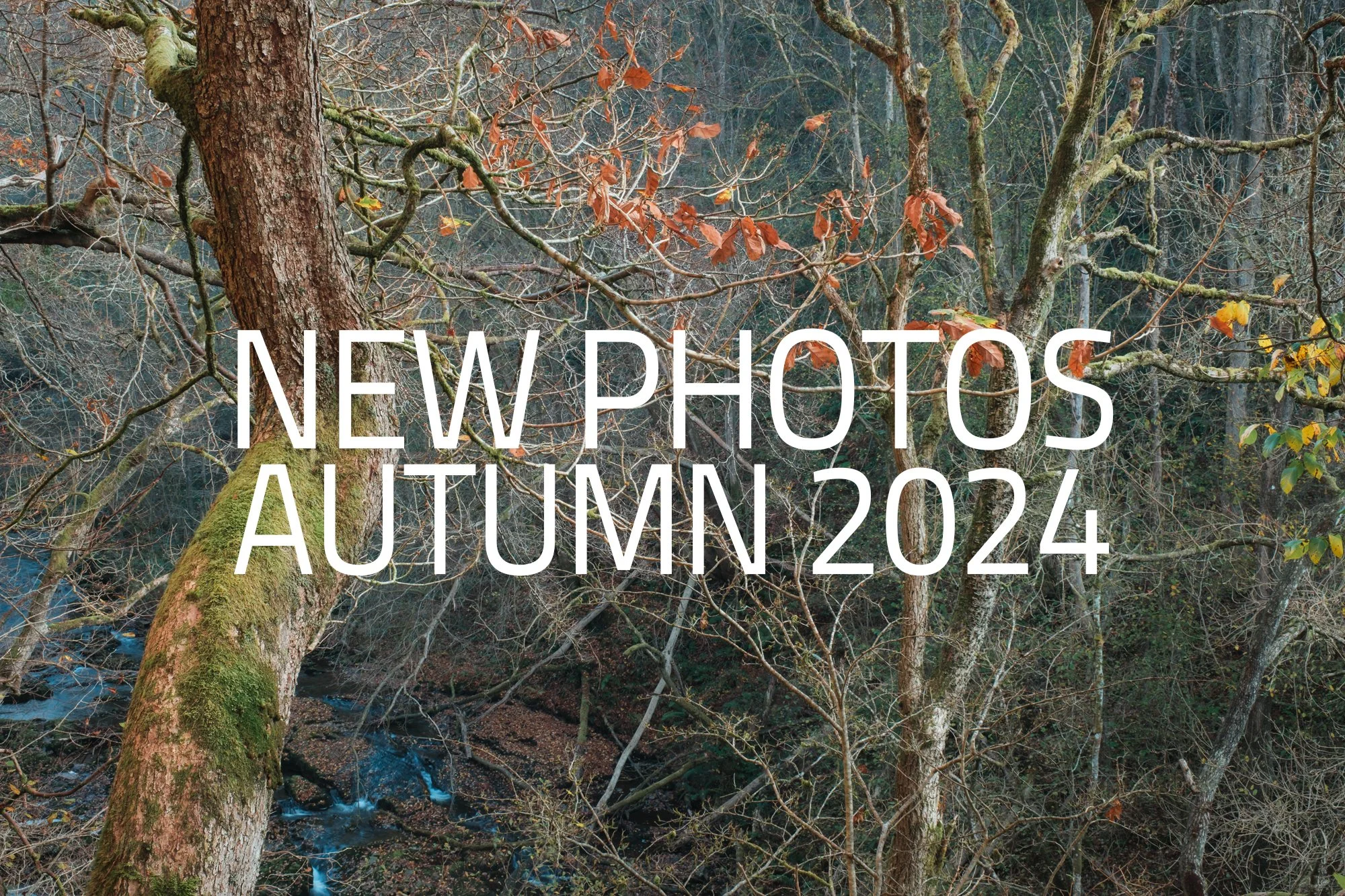
New Photos | Autumn 2024
A collection of photos taken during Autumn 2024.
This is now the fourth instalment of my “New Photos” series, a project conceived to ensure my photography is seen on my website and in my newsletter before being shared on social media. These aren’t portfolios showcasing my very best work, but more a snapshot of the share-worthy photos I made during those three months and if, during that time I manage to take just one or two portfolio images then I consider that a bonus.
Below are the previous three instalments of my “New Photos” series.


September to November 2024 - Autumn 2024 collection.
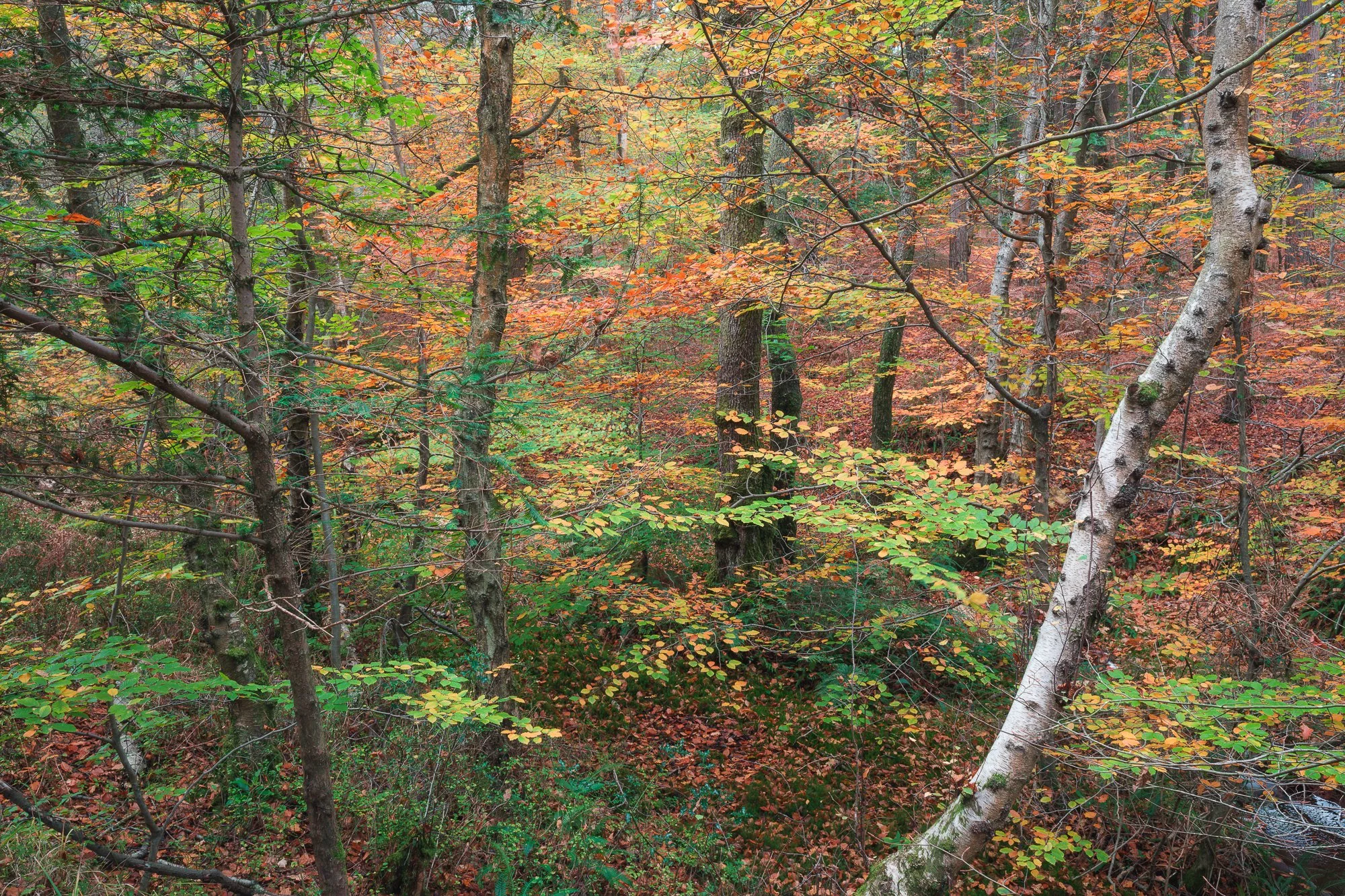
One thing you might notice in this edition is just how few traditionally wide landscape photos I took during the autumn. For various reasons back in 2023, I didn’t have the time I wanted to photograph the changing colours in my local forest, so in 2024, I made a concerted effort to spend more of my photography time there and as a result, I had less time to photograph what would be considered traditional landscapes.
(You can click on the smaller photos to see a larger version)
Apart from the photo of Brighton’s West Pier below and London’s cityscapes further down, the only shareworthy landscape images I photographed were taken from the same spot. This viewpoint overlooks part of my local forest and is one I visit often before venturing off amongst the trees to photograph the woodland.
Landscape Photography
I’ve spoken before about the West Pier along England’s south coast in Brighton and how I visit from time to time to photograph this composition, capturing its skeletal remains as it slowly gets taken by the sea. On this particular morning in early autumn, conditions weren’t great and I had no light to speak of, but I kept this photo because of the additional context it provided. The water was clear and for the first time in countless visits, I could see the scattered pieces of metal that had fallen into the sea when the pier collapsed, adding to the story of this cursed seaside structure.

Cityscape photography in London
These days, nearly all the time I have to photograph London is spent creating work for my Timeless City project. I tend not to share those photos here as I’m still building that body of work, adapting and learning as I go, but every so often, I’ll take a picture I feel should also be processed in colour. Alongside this, I feel that my shift to taking more black-and-white cityscape photos is now starting to influence my colour work, (for the better I hope). My colour photos are more muted with less busy compositions and a simpler colour pallet.


Photographing an autumnal woodland
As mentioned above, I spent a lot more time this year amongst the trees, photographing the colours as they changed from deep, late summer greens to vibrant oranges, yellows and finally the dull browns of late autumn. My ability to look closer at the woodland has slowly improved and as such I thoroughly enjoyed my time last year, stretching myself photographically, and finding new, intimate compositions while revisiting some old favourites along the way.


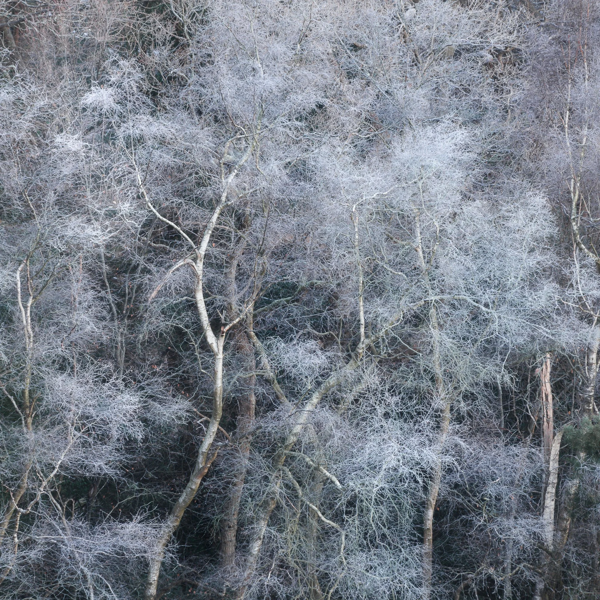
Although I’m generally happy with the photos I took of the Autumnal woodland in 2024, particularly the tighter, intimate compositions, I still feel I lack the vision and awareness to spot the small scenes around my feet and as a result, I don’t take anywhere near as many photos of small scenes as I would like. I did manage to take a few, however. The green fern at the beginning of autumn and bookending the season, a collection of frosty fallen leaves towards the end of November.


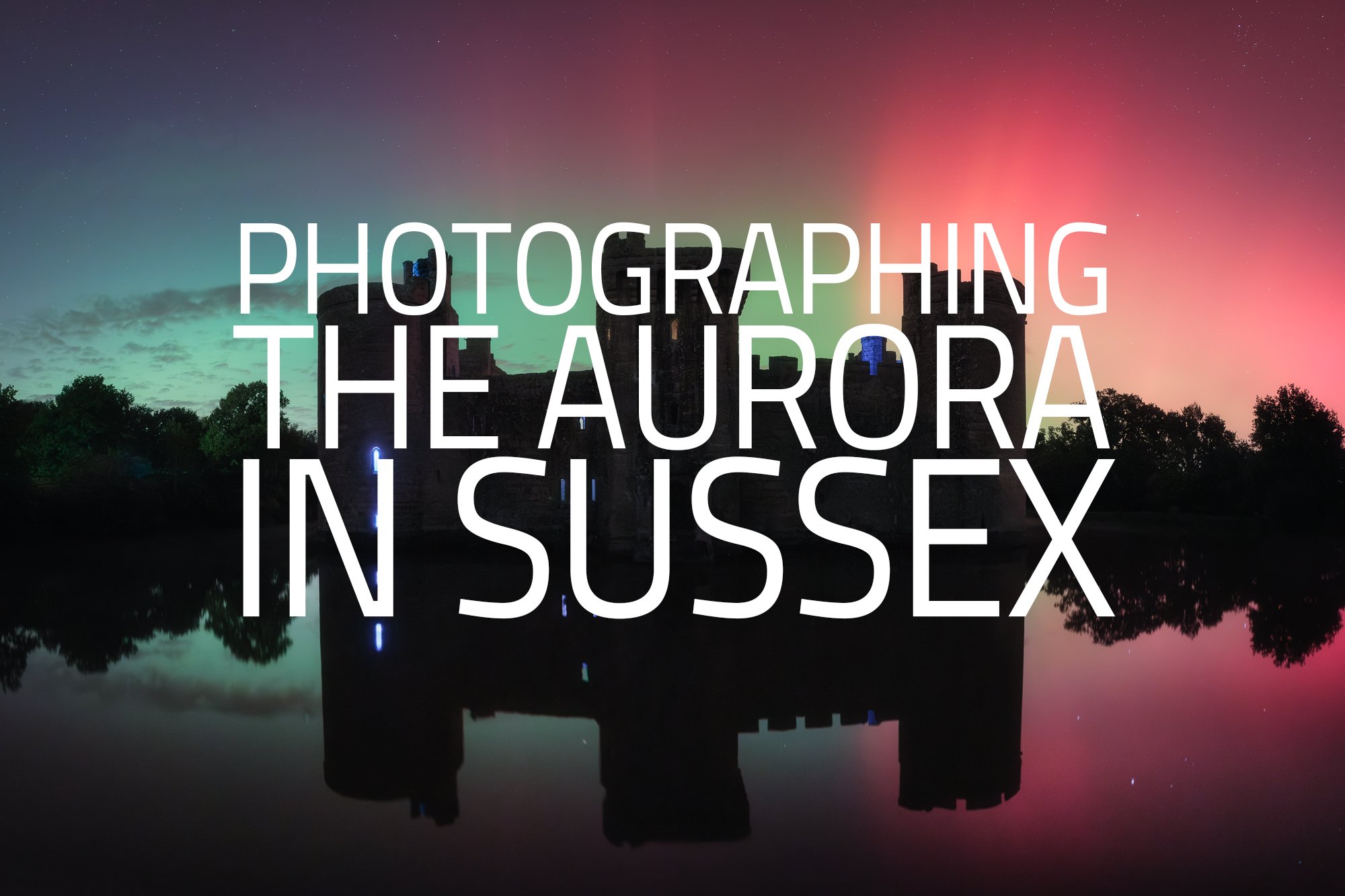
Photographing the northern lights in Sussex
As I left work one evening in October, the socials were ablaze with aurora alerts for the south of England and having missed the opportunity to photograph the northern lights back in May, I quickly decided to head out of the city and into Sussex to try to capture them. I wrote more about this amazing evening of photography in the blog post below.


Photographing the Brecon Beacons in Late Autumn
In mid-November, I made a late dash to the Brecon Beacons to photograph the waterfalls. Being so late in the season, nearly all the leaves had fallen, leaving very little foliage on the trees, but I dug deep, got creative and came away with a handful of photos I liked.


Wow, that’s over 40 photos I’ve shared from my photo outings in Autumn. I’m pretty happy with that. As always, feel free to message me or leave a comment with any questions or feedback you may have.
Until next time,
Trevor

Outdoor Photogrphy Magazine Feature
I was featured in a recent edition of Outdoor Photography magazine. Read the article here.
After a very generous recommendation from the talented Vanda Ralevska, I was recently (and very kindly) asked by writer and author, Nick Smith, to be interviewed for a multi-page feature in the UK’s Outdoor Photography Magazine. We met one afternoon in London and talked about all things photography such as how I got started, why I enjoy photographing the London cityscape and the synergies between cityscape and woodland photography.
I was also given a PDF copy to share with viewers of my website. If you have a few minutes, I welcome you to have a read and as always, feel free to post any questions or feedback in the comments below.
Alternatively, you can read the article using this embedded version or download it directly here.